Homescreen - Brand Identity
Scope
Creative Direction
Logo
Typography and Color
Layouts and Collateral
Brand Guidelines
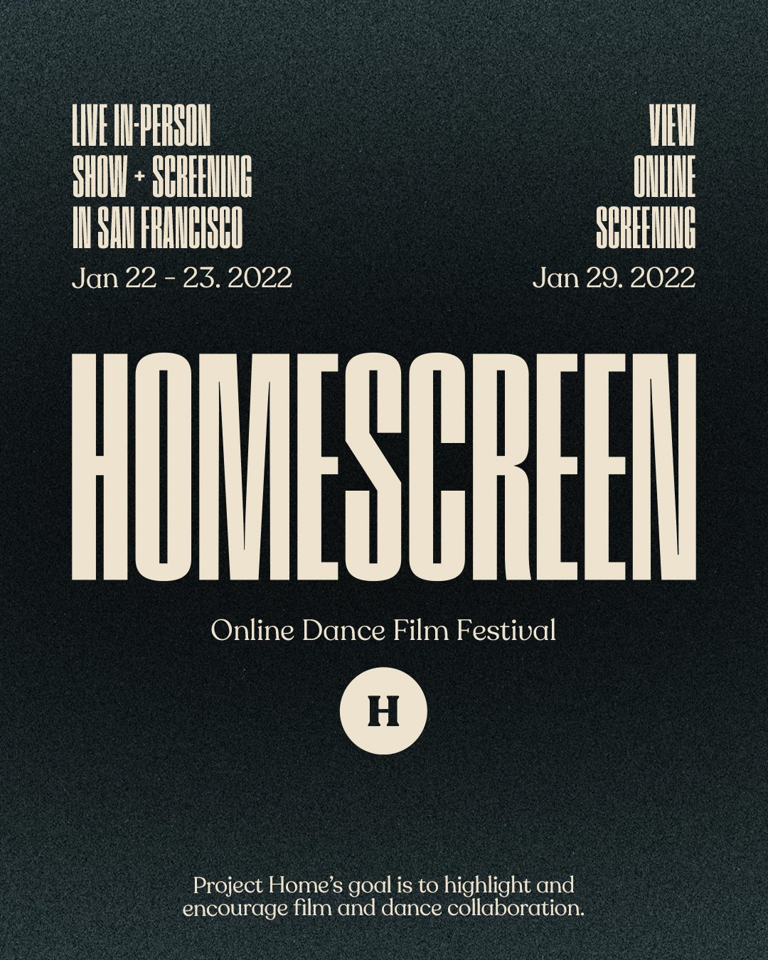
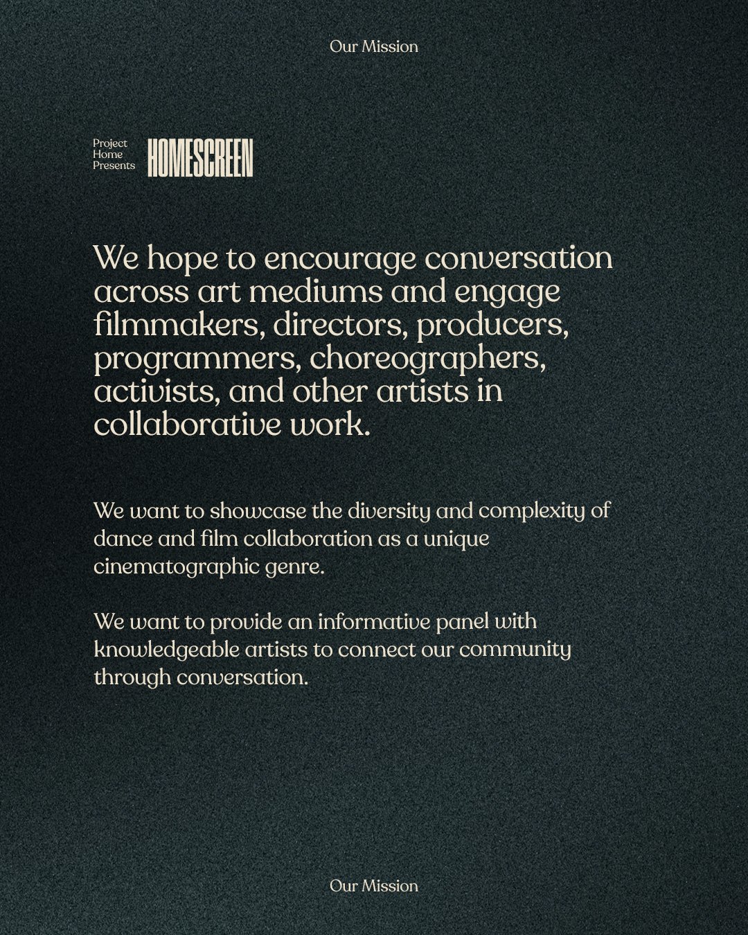
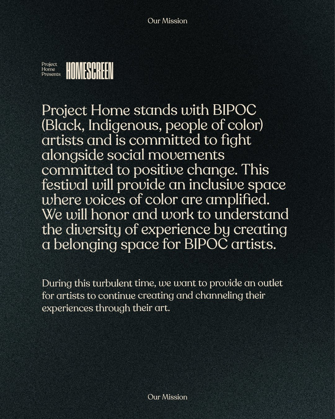
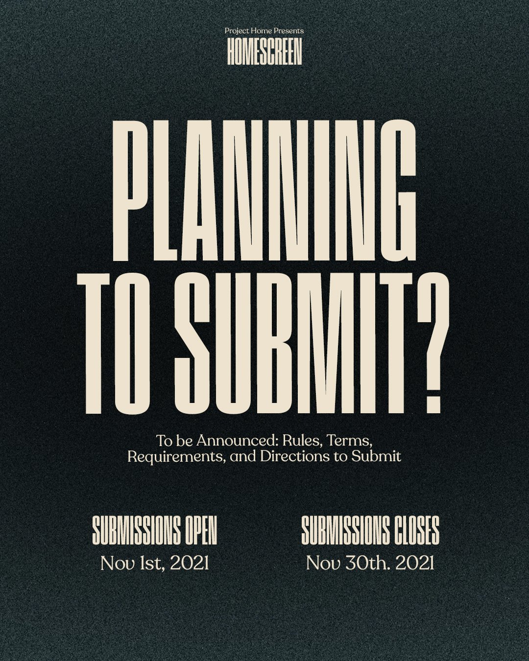
HOMESCREEN is Project Home’s second annual movement film festival. The festival consists of a professional judging panel, live + online film screenings, and a contest; welcoming all identities, languages, and movement backgrounds. HOMESCREEN hopes to provide a platform for artists to engage, connect, and grow through collaboration and conversation.
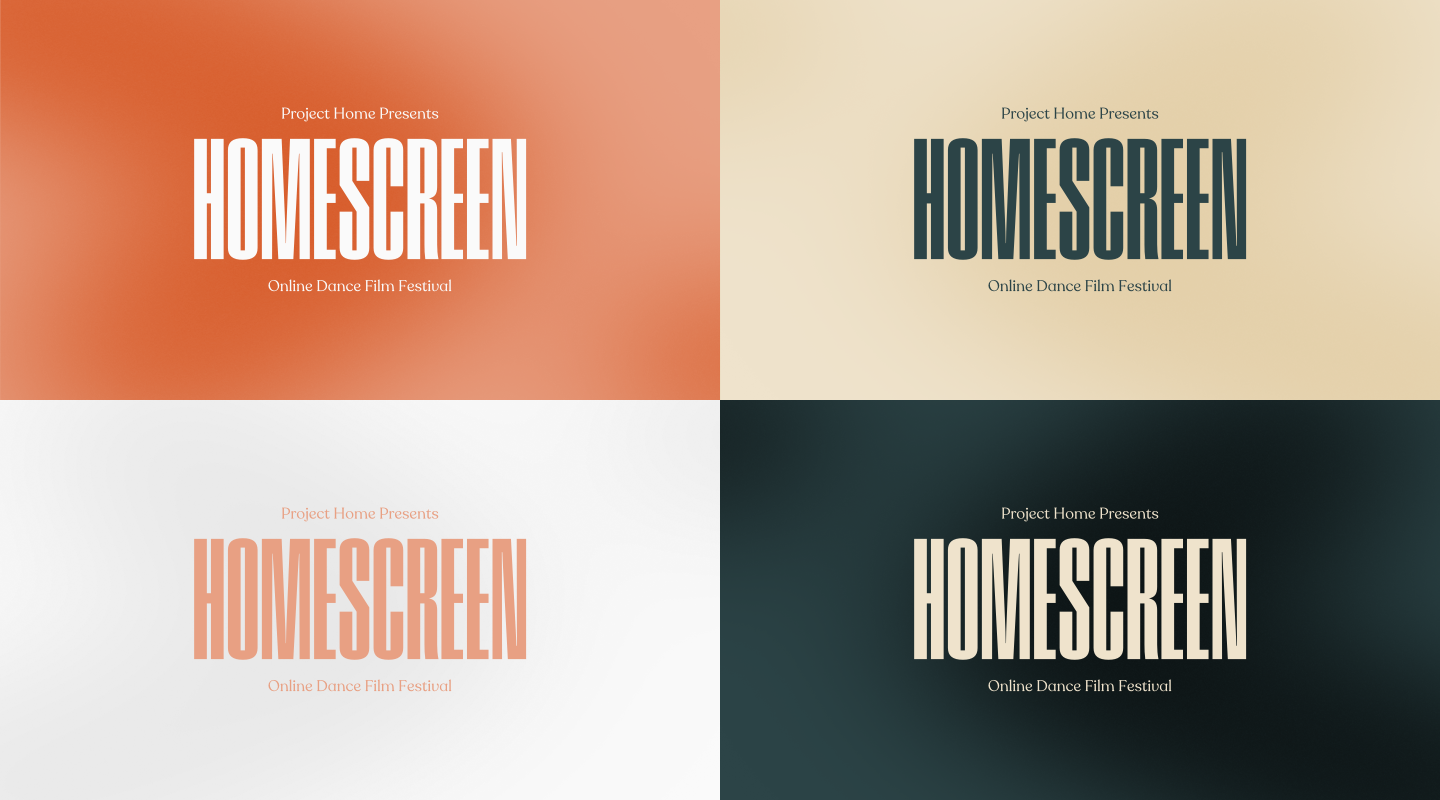
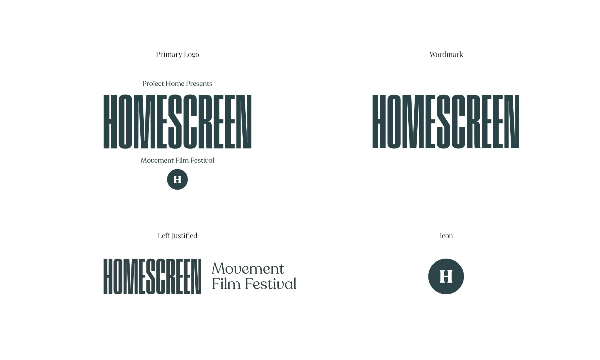
The logo features an ode to the old typeface of the previous logo. The name and logo allude to the family umbrella of Project Home’s Brand. The color palette is a soft, yet vibrant take on the variety of films that have been displayed, and the grainy texture mirrors the film grains of vintage films.
Brand Color Palette



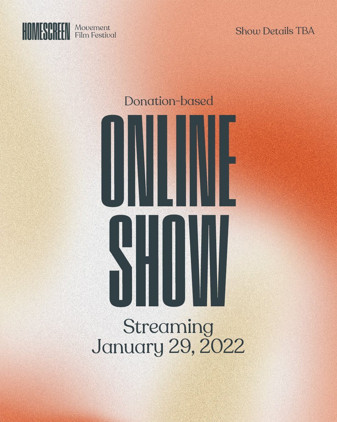


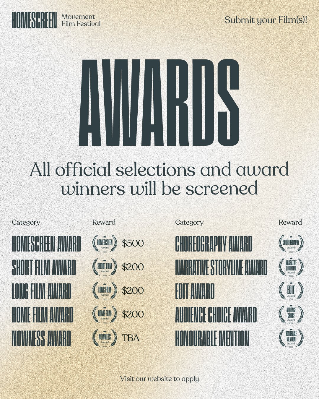
Layouts and Collateral
At the live-show, I created each individual Digital Laurel and they printed out posters for the official selections and winners of the festival.
Brand Guidelines

